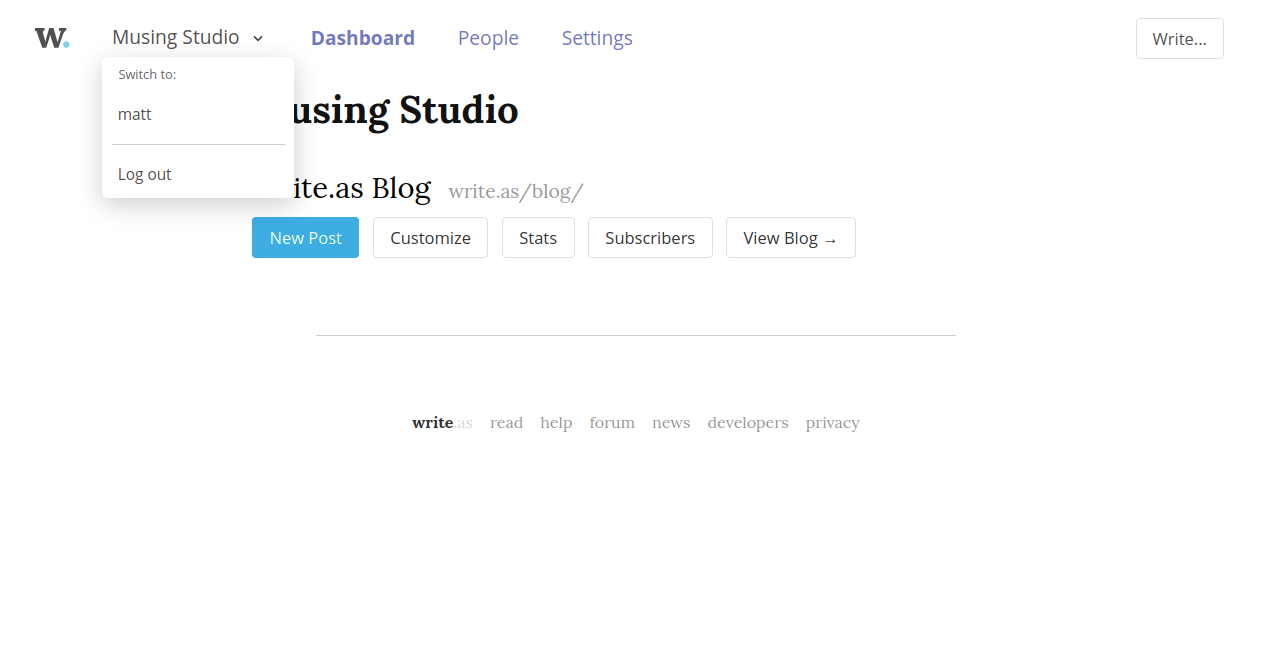
Implemented the Write.as context switching system! It shares a bit of plumbing and UX with the Snap.as system, but diverges otherwise, since we have a /me/ base path for all “personal account” screens and an /org/ base path for all team-related screens. That means we don’t need as much state-tracking here, unlike on Snap.as.
Overall, the team-based navigation feels a lot cleaner to me (though I still need to get used to it). Here’s what it looked like before, where you’re always acting as the user and really just “visiting” teams you’re a part of (note the top navigation bar that mixes personal sections with your team):

Here is the new layout, with a pared-down context menu that allows you to switch back to working in a personal capacity:

Some notes:
- All those extra pages (Profile, Integrations, Billing) have been moved under the Settings section (though I guess moving them to the context menu dropdown would keep things consistent.)
- I haven’t settled on the “Dashboard” terminology, though it might be helpful to show helpful things from across the suite here — new submissions, new comments, etc.
- When we support shared drafts for teams, I imagine adding a Posts section to the top navigation
Thoughts? Discuss...